
One curve, built from the entire chain.
The calculator uses the full options chain to build a market-implied, skew-aware probability distribution for the stock at expiration.
Instead of assuming prices follow a simple bell curve, it uses option prices across strikes to capture direction, expected movement, skew, and the premium investors are paying for protection against large moves.
The result shows where future prices are being priced and how the market values risk across the entire range of outcomes.
Move the curve. Watch what it tells you.
Watch the entire shape of the curve. Its position shows where probability is being concentrated. Its width shows expected uncertainty. Its tails show where investors are paying more for protection.
Drag a control to see how the curve responds.
Shift left: more downside probability · shift right: more upside probability
Wider curve: more uncertainty · narrower curve: less uncertainty
Larger left tail: more downside risk pricing · larger right tail: more upside risk pricing
Market Probability plus Your Strategy P/L
The calculator places your strategy directly against the probability distribution, so you can see where the trade makes money, where it loses money, and how those areas line up with the outcomes currently being priced.
A payoff diagram may look attractive on its own, but that does not tell you how likely each part of the payoff is. Combining payoff and probability gives the trade context. The question becomes: Does the probability and pricing of the possible outcomes justify this trade? You can then compare what the options market is pricing with your own research, technical analysis, fundamental analysis, volatility view, or investment thesis.
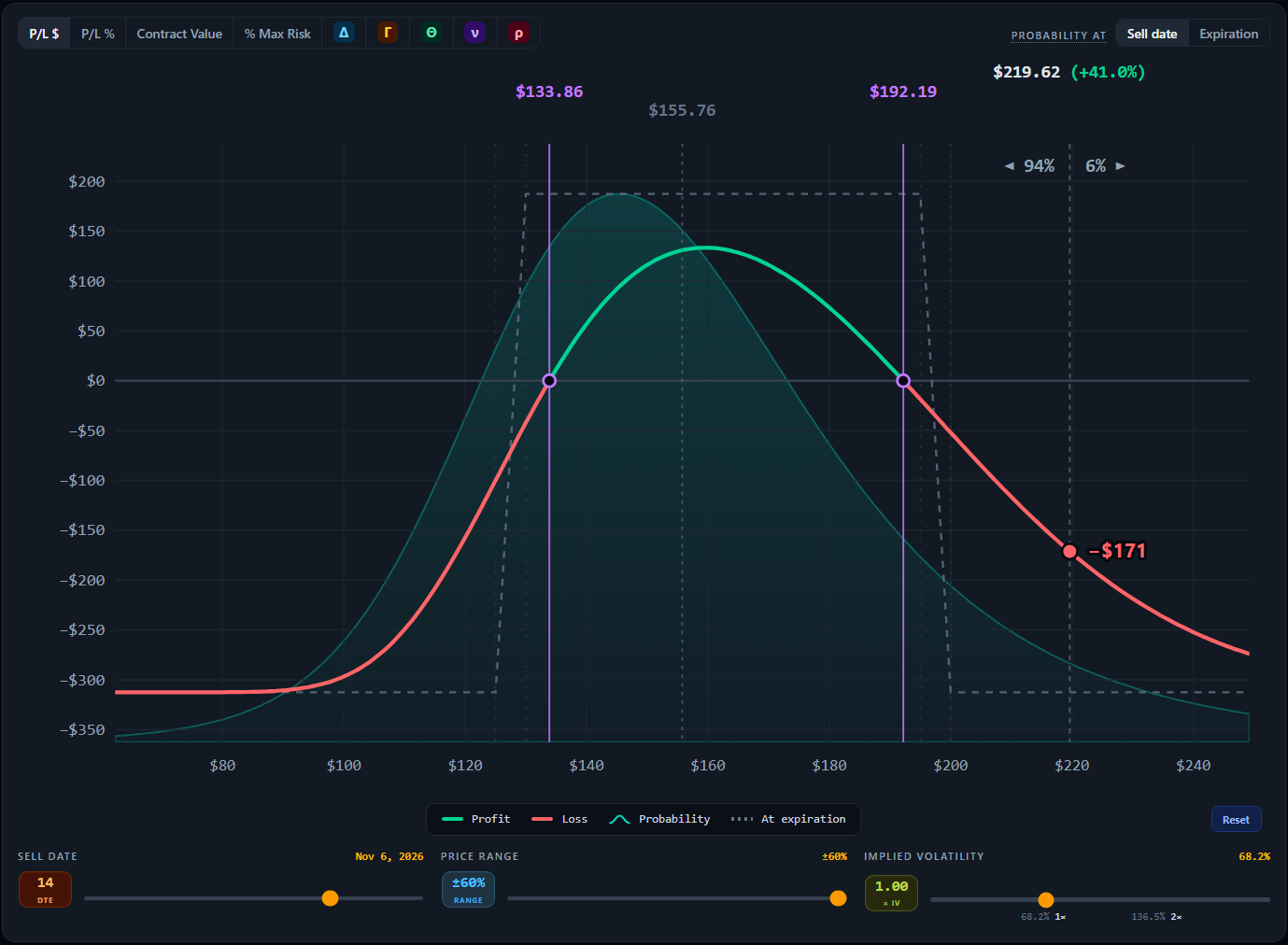
Now the payoff and probability come together. You can see exactly where your strategy profits and loses relative to the outcomes currently being priced by the options market.
Insightful metrics, weighted by every outcome.
Expected Value, or EV, combines the size of every possible profit and loss with the probability of each outcome. At its simplest: Probability × Outcome across the entire distribution.
In an efficient market, modeled EV should generally be near 0 at today’s market-implied IV. However, modeling higher or lower IV shows how your assumptions affect EV.
When the market is inefficient, a sufficiently large EV may reveal a meaningful pricing edge that rises above model noise and transaction costs.
A profit-and-loss reading at every price the market can reach
| $60 | $80 | $100 | $120 | $140 | $160 | $180 | $200 | $220 | $240 | |
|---|---|---|---|---|---|---|---|---|---|---|
| Chance | 3% | 7% | 13% | 19% | 21% | 15% | 11% | 6% | 3% | 2% |
| P/L | -$400 | -$260 | -$130 | -$45 | +$115 | +$260 | +$200 | +$135 | +$60 | +$30 |
Each price’s P/L, weighted by its probability, then summed
The modeled probability that the position finishes with a profit, after the premium paid or received.
The amount of buying power the trade is expected to use or tie up under standard Reg T rules for a margin account.
The annualized expected value generated for each unit of capital committed, showing how efficiently capital is used through time.
Expected Value, priced against your capital.
Expected Value becomes more useful when you compare it with the capital required to hold the position. The calculator shows several related metrics together.
- EVWhat is the average modeled outcome?
- Chance of ProfitHow likely is the trade to finish profitable?
- Buying PowerHow much capital does the position require?
- EV per CapitalHow much Expected Value am I receiving for that capital?
- Annualized EV per CapitalHow efficiently is the capital being used through time?
Together, they answer a better question than simply asking how much the trade can make: How efficiently is this trade using my capital for the risk and time involved?
Annualized EV per Capital can also be compared with other opportunities and long term benchmarks such as the historical return of the S&P 500, for context. It is not a direct equivalent. A short duration options trade has different risks, reinvestment assumptions, transaction costs, and path dependence than a diversified long term equity investment.
Two trades can have the same Expected Value but require very different amounts of capital or time. EV per Capital and Annualized EV per Capital put those differences into perspective.
The trade does not stop changing at entry.
The calculator is useful throughout the life of the position, not just before entry. Check it again as market conditions change. You may see the distribution shift, volatility rise or fall, skew change, or tail risk pricing increase.
You can then compare the current market with the conditions that originally supported your trade. If new information challenges your thesis, the main application and Education Center can guide you through failure states, thesis breaks, important price levels, trade management, and what to consider when the position moves against you.
The same trade, priced differently over time.
The probability curve can also be tracked over time. If you have been following a stock through a sustained uptrend or downtrend, changes in option pricing may show that the market is beginning to price risk differently.
You may see the distribution shift, skew flatten or steepen, expected movement change, or elevated tail premiums begin to decline.
These changes do not predict a reversal on their own. They can, however, show that expectations and risk pricing are changing before that change becomes obvious from price alone.
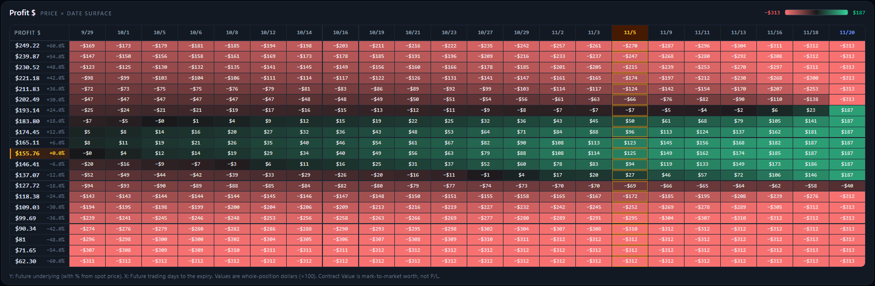
The same shift shows up across the full price and time surface, not only at expiration.
Watch how the curve evolves. The stock may look similar while option pricing underneath it begins to change. Shifts in probability, skew, or tail premiums can show that the market is evaluating risk differently than it was before.